Choosing the Perfect Colour Palette for Your Home
Colour is more than paint on walls; it’s the personality of your home. From energising shades to calming neutrals, the right home colour schemes can transform a space, influence mood and create a connection between rooms. When used thoughtfully, colour brings balance, depth and emotion, but with so many shades to choose from, it can feel overwhelming.
Basics of Colour in Interior Design
Colours are generally categorised as warm or cool, alongside neutrals and vibrant tones. Your ideal home colour schemes should reflect what you love and how you want your home to feel. Whether you have colours in mind or are starting fresh, understanding colour principles helps you apply your palette with intention and harmony.
How Do You Want Your Room to Feel?
Creating a palette isn’t just about rules, it’s about mood. Softer, muted colours like warm neutrals, gentle greys and earthy tones encourage calm and relaxation. Brighter, more saturated shades bring energy, vibrancy and personality, perfect for social or creative spaces.
The key is balancing tones, layering shades and considering how colour interacts with light and furnishings to create a cohesive, expressive palette suited to your home.
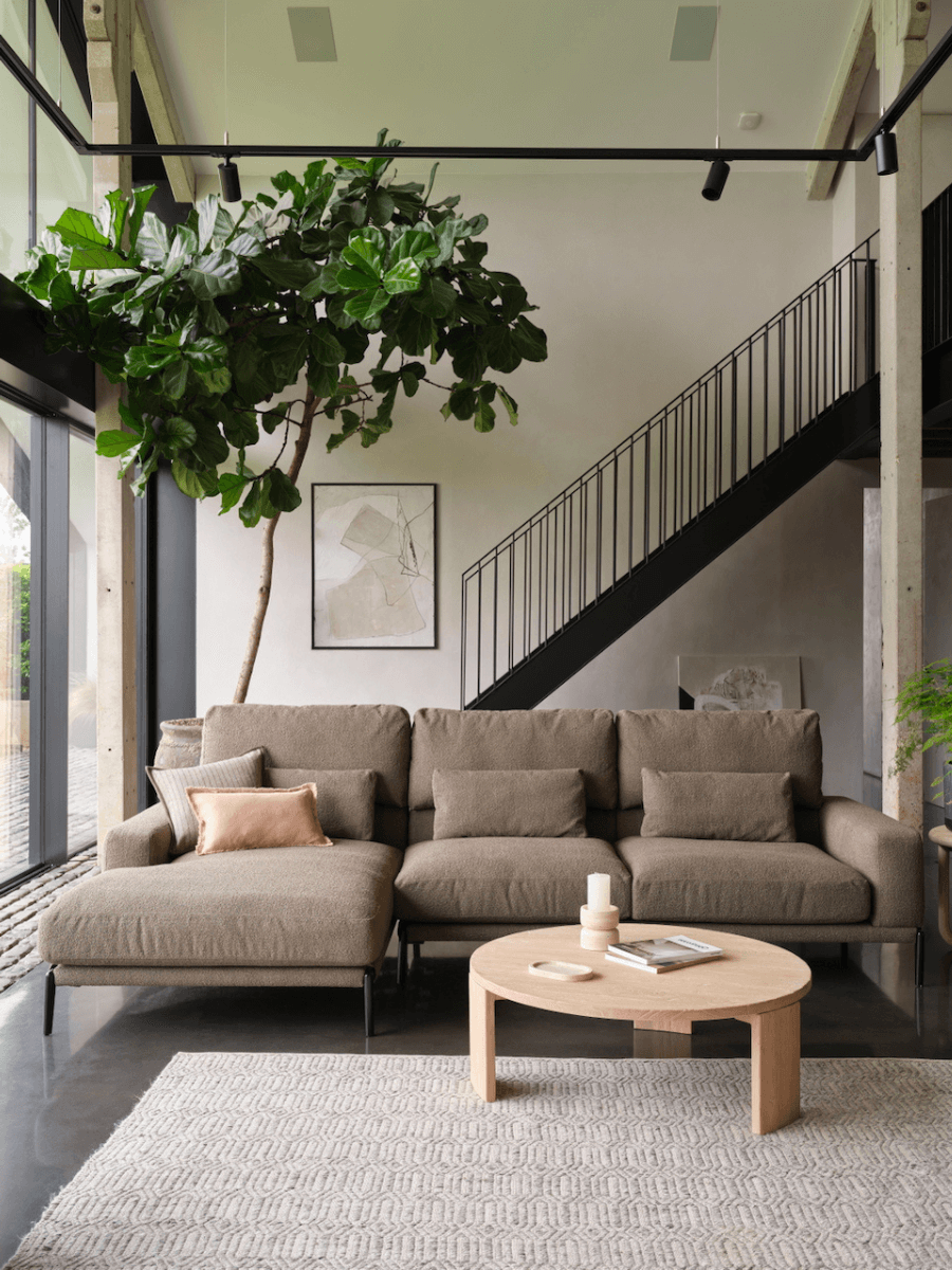
Creating a Cohesive Flow Between Rooms
To make your home feel connected, repeat colours across spaces. For neutral schemes, this could be the same off-white on walls, trim or ceilings. Or, vary the intensity of a single colour to give each room a distinct feel while keeping the overall home visually linked.
Highlighting Features and Adding Interest
Use colour to draw attention to focal points, such as a dining table, armchair or headboard, or highlight architectural features like fireplaces, beams or bay windows. Subtle contrast, texture or a slightly bolder shade can make these features stand out while keeping the space harmonious.
Building a Balanced Palette
The 60/30/10 Rule
Allocate 60% of the room to a dominant colour such as walls, large furniture or flooring to set the overall tone. Use 30% for a secondary colour in smaller furniture, rugs or curtains to add depth and interest. Finish with 10% accent colour through accessories, artwork or statement pieces to inject personality and create focal points.
This formula guides the eye, maintains harmony and lets you experiment with bolder shades in small, impactful doses.
The 70/20/10 Rule
Divide your room into 70% dominant colour for walls, large furniture or flooring. 20% would be your secondary colour used for rugs, curtains and smaller pieces. The final 10% accent colour through cushions, artwork or decorative objects.
This formula creates a cohesive, layered look while allowing your personality and style to shine in small but impactful ways.
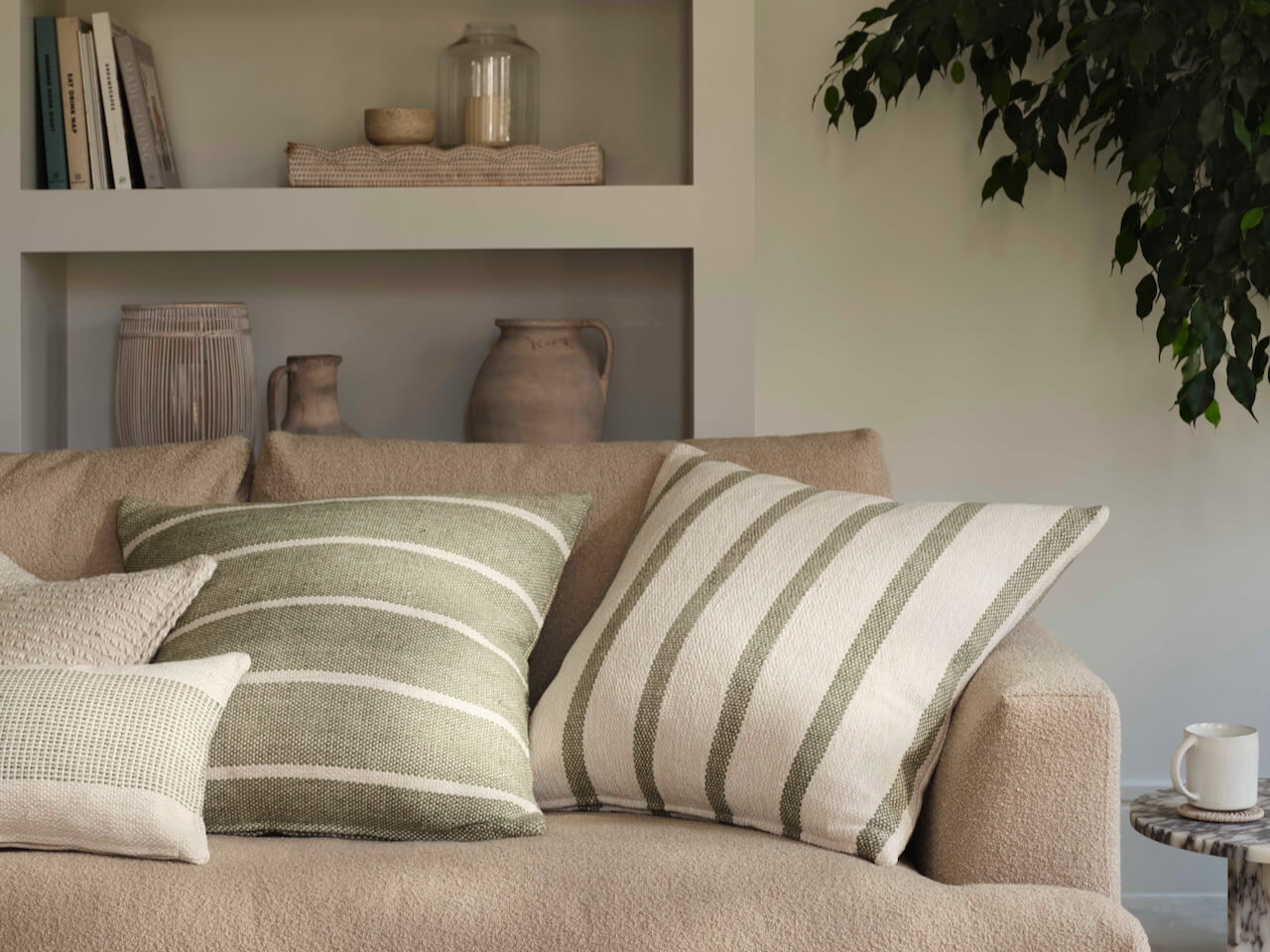
Accent Colours & Personality
Accents inject energy and individuality. Use them in cushions, artwork, decorative objects, or even a feature wall. Bold colours or metallics can create focal points, while softer tones reinforce the home colour schemes. For rhythm, repeat your accent in three areas, a throw, a vase and an artwork, to guide the eye naturally through the space.
Common Colour Mistakes to Avoid
-
Too Many Competing Colours: Stick to dominant, secondary and accent shades.
-
Ignoring Lighting: Test colours in natural and artificial light.
-
Being Too Rigid: Allow texture, pattern and tone variation.
-
Overlooking Scale and Placement: Large or tiny colour blocks can overwhelm or get lost.
-
Neglecting Flow Between Rooms: Ensure each room relates to the next for cohesion.
Confidently Create Your Perfect Palette
Choosing colours is about creating a home that feels harmonious, purposeful and reflective of you. By understanding mood, following the 60/30/10 or 70/20/10 rules, layering textures and accents and considering light, you can design cohesive, inviting and visually engaging interiors.
Thoughtful colour choices highlight your favourite features, guide the eye, and bring warmth, balance and personality to every room. Well-planned home colour schemes turn a house into a home that’s stylish, welcoming and uniquely yours.
